Contact info +


.png)


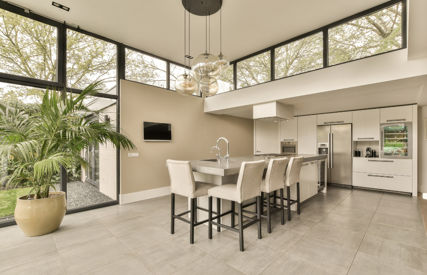
Open concept homes are beautiful because everything connects, but that same openness can make a space feel visually noisy fast. One busy floor pattern bleeds into the kitchen, the backsplash competes with the island, and suddenly the “airy” plan feels chaotic. At Design Surfaces, we help Cleveland homeowners make tile choices that feel calm, elevated, and intentional across sightlines. The goal is not to play it safe or choose boring finishes. It is to select tile that supports flow, highlights premium surfaces, and keeps your home looking polished from every angle.
In a traditional layout, tile can be a single-room decision. In an open concept home, tile is part of a larger visual system. Your eye takes in the flooring, kitchen backsplash, countertops, and even fireplace surrounds all at once.
When tile creates visual clutter, it is usually because of:
Cleveland homes also deal with shifting natural light through seasons, which can make contrast and undertones feel stronger than expected, especially in large, bright great rooms.
The easiest way to avoid visual clutter is to decide what gets to be the hero. In most open concept homes, the lead surface is one of these:
Once you pick the lead, everything else should support it, not compete with it. This is where choosing tile for open concept homes without visual clutter becomes much easier, because you stop selecting materials in isolation.
If you want an upscale, cohesive look, follow this order:
Flooring is the largest continuous surface in an open concept plan, so it has the most power to create either flow or clutter.
Look for:
These choices often create visual noise:
If you love a patterned tile, consider using it as a contained moment, like a mudroom inset, powder room floor, or a small bar area, rather than the main open concept run.
In an open concept Cleveland home, your backsplash is rarely only seen from inside the kitchen. It is visible from dining, living, and entry sightlines, which means it needs to read clean from a distance.
A quiet backsplash does not mean plain. It means controlled.
A great backsplash for an open layout often has:
If you have a dramatic countertop with movement, your backsplash should usually be simpler. If your countertop is very minimal, your backsplash can add dimension through shape or texture, not loud pattern.
Grout is one of the fastest ways to create visual clutter without realizing it. In open concept spaces, grout lines can read like a strong design element even when you did not intend them to.
If your goal is choosing tile for open concept homes without visual clutter, a blended grout color is usually the safest path.
Many “almost right” open concept palettes fail because undertones fight. Gray can lean blue, greige can lean green, and creamy whites can pull yellow under warm lighting.
Bring samples home and test them:
This step matters in Cleveland because winter light is cooler and dimmer, while summer light can amplify warmth. Tile that feels balanced in a showroom can shift once it is installed.
Open concept homes should feel layered, not flat. You just want the interest to be intentional and placed where it will not overwhelm the main sightlines.
These moments work best when the main floor and kitchen palette stays calm and cohesive.
Use this before placing your order:
Design Surfaces is experienced in helping Cleveland homeowners build these palettes with confidence, using full-scale viewing and real-world comparison in the showroom.
Choosing tile for open concept homes without visual clutter is about more than picking a neutral color. It is about controlling pattern, grout contrast, undertones, and how surfaces relate across long sightlines. When your floors, backsplash, and stone surfaces support one another, your home feels larger, cleaner, and more high-end. Design Surfaces is proud to be a trusted local resource serving homeowners, designers, and contractors across Cleveland who want polished results without guesswork.
Ready to build a cohesive open concept palette? Visit the Design Surfaces showroom to compare tile, countertops, and stone surfaces side by side, and let our team help you choose materials that keep your space elevated, connected, and beautifully uncluttered.
Call: 440.753.6952 • Contact: Submit a Request • Email: info@designsurfaces.com


