Contact info +


.png)


Grout may seem like a small detail, but it has the power to elevate or weaken an entire tile design. A beautifully selected tile can lose its impact when the grout color feels off, clashes with undertones, or shows stains far sooner than expected. At Design Surfaces in Westlake, we often meet Cleveland homeowners who tell us they wish they had understood grout selection earlier in their renovation process. This guide breaks down the most common grout color mistakes, how to avoid them, and how our experts help you choose a grout that supports your design vision with confidence.
Grout is more than a finishing material. It shapes how the tile pattern reads, how bright or muted a space feels, and how well the installation holds up long term. The right grout color creates cohesion, enhances the tile, and supports your design goals. The wrong one can create visual clutter, make soft tones look washed out, or show wear almost immediately.
Why grout color matters:
At Design Surfaces, serving homeowners, designers, and contractors across Cleveland, we help you consider every angle before committing to a grout color.
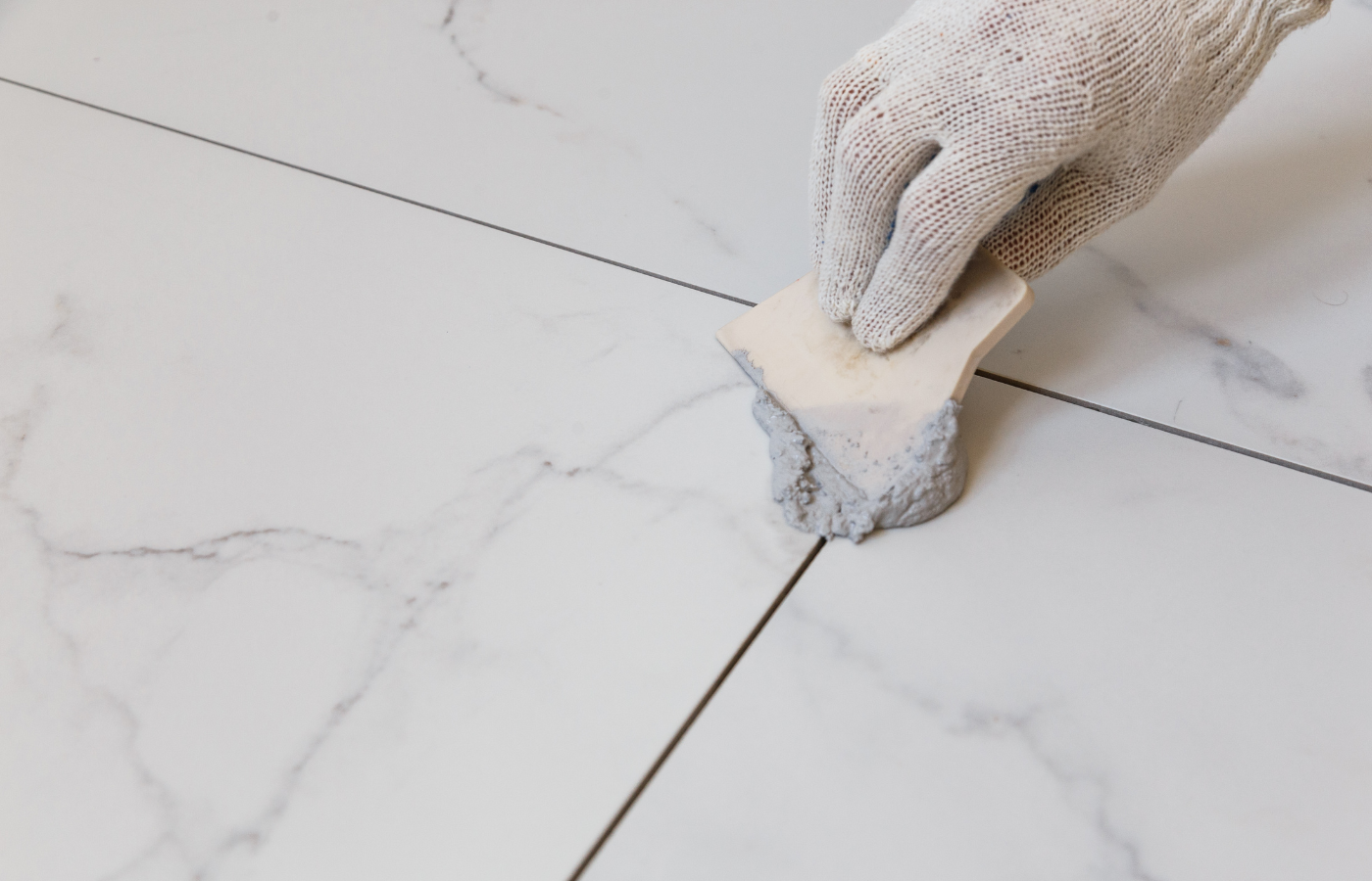
Selecting grout from a paper chart or digital photo rarely shows how it will behave in your home. Tile texture, finish, and lighting all influence how grout appears once installed.
Avoid this mistake by:
Pro insight: Grout often dries lighter than expected, so always test before deciding.
Once you see the tile and grout together, the next step is making sure your color choice holds up in high traffic areas.
White grout can look bright at first, but kitchens, showers, backsplashes, and entryways tend to discolor pure white quickly. Even with proper sealing, it will need regular upkeep.
Better alternatives include:
If you strongly prefer the brightness of white, choosing a slightly off white shade often provides a more durable solution. After selecting a practical shade, it is time to evaluate how the grout interacts with your tile pattern.
Grout influences whether a tile installation looks bold or seamless. A grout color that contrasts heavily can make patterns feel busy, while a matching tone can soften them too much.
Use contrast to highlight patterns:
Use matching grout for calm, seamless designs:
After understanding pattern and layout, consider undertones so the grout and tile feel unified.
Undertones matter. Cool grays, warm creams, and blended taupes all affect how grout pairs with your tile.
How to choose correctly:
At Design Surfaces, we help you identify undertones that are easy to miss but essential for a cohesive design. Once the undertones are correct, the next factor is style and room size.
Dark grout creates drama but can overwhelm small kitchens or bathrooms. It is best suited for installations with strong contrast or ample natural light.
Dark grout works well when:
If your home leans warm, airy, or traditional, a softer grout shade may be a better match.
Some grout colors hide dirt beautifully, while others require more cleaning. Maintenance is just as important as style.
Lower maintenance grout colors:
Higher maintenance colors:
After choosing a maintenance level that suits your lifestyle, evaluate how spacing affects the final look.
Grout width affects style just as much as color. Narrow joints feel clean and modern. Wider joints create visual texture and emphasize pattern. Handmade or natural stone tiles often look more balanced with slightly wider spacing. Choosing the right width helps your tile installation feel intentional rather than accidental.
Lighting plays a major role in grout appearance. Natural light softens tones, while warm or cool bulbs can shift the look of whites, beiges, and grays. Creating a small sample board and viewing it at home ensures your grout color remains consistent throughout the day.
Choosing a high quality grout formulation protects your tile investment. Light colors especially benefit from stain resistant or epoxy based options that maintain a cleaner appearance over time. At Design Surfaces, we help Cleveland homeowners select grout that supports both beauty and long term durability.
Tile and grout should never be chosen separately. Undertones, finishes, and lighting interact in ways that are not always predictable. Viewing them together helps you visualize the finished project and prevents surprises on installation day. Selecting both materials at the same time ensures that the final design feels cohesive and balanced.
Grout performs best when paired with premium tile, and that is where Design Surfaces truly stands out. Our Westlake showroom features curated ceramic, porcelain, natural stone, terrazzo, zellige, glass, and large format tile collections known for their craftsmanship, color depth, and long term performance. You can compare full tile boards with grout sticks to understand real world pairings and how each combination will look in your home. Serving homeowners, designers, and contractors across Cleveland, we help you match undertones, choose the right grout width, and select a finish that elevates your space beautifully.
Grout color may seem like a small decision, but it plays a major role in how your tile installation looks, ages, and functions. When selected correctly, grout enhances tile design, simplifies upkeep, and creates a finished space that feels intentional and refined. At Design Surfaces in Westlake, serving homeowners, designers, and contractors across Cleveland, we guide you through every step of choosing tile, stone, and grout so your renovation feels elevated from the start. Visit our showroom to explore grout samples, compare tile combinations, and receive expert recommendations tailored to your project. Let Design Surfaces help you create a home with stunning details that last.
Call: 440.899.9900 • Contact: Submit a Request • Email: info@designsurfaces.com


