Contact info +


.png)


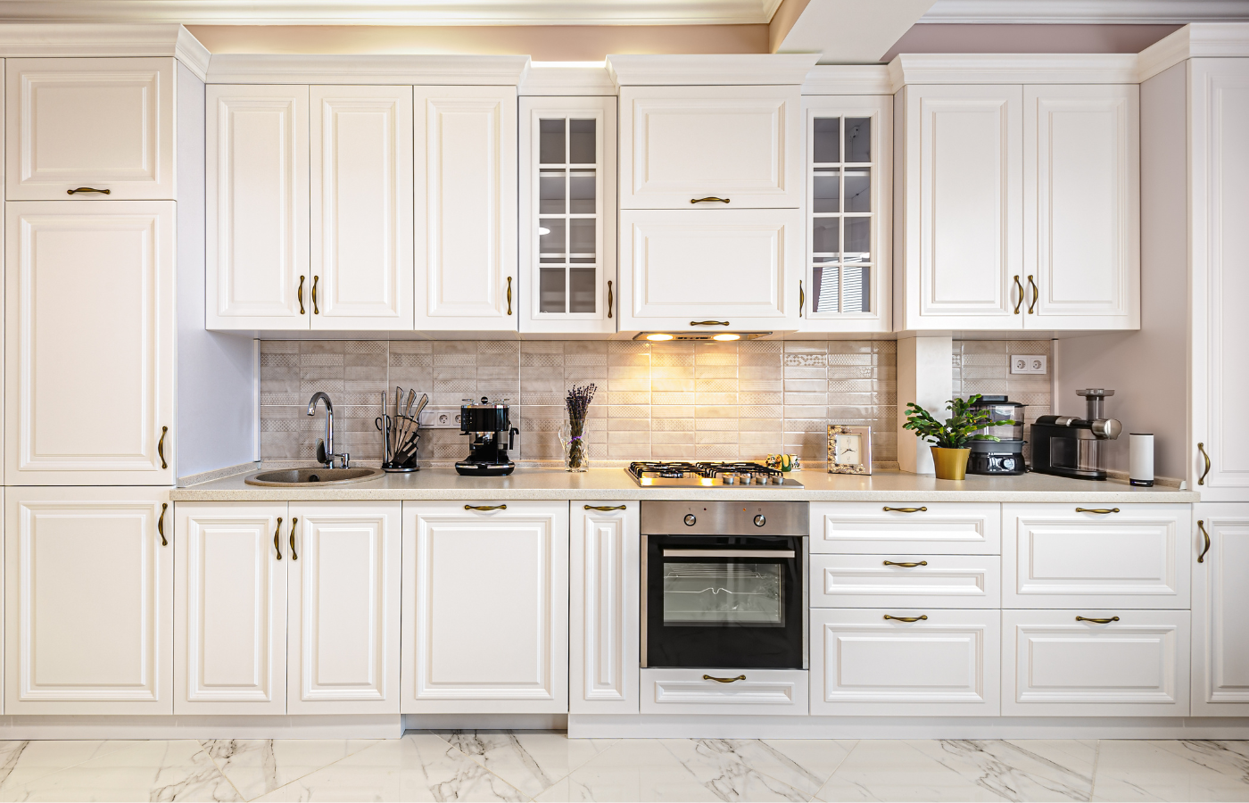
A kitchen can look “almost right” and still feel off. The cabinets are beautiful. The countertop is high-end. The lighting is perfect. Yet something clashes in a way you cannot quite name. In most cases, the problem is not the color itself. It is the undertone. At Design Surfaces, we help Cleveland homeowners make countertop and cabinet selections that feel intentional, cohesive, and elevated, because undertones are what separate a showroom-pretty kitchen from a truly polished one.
If you are remodeling or building new, this guide will show you exactly how to pair countertops with cabinet color undertones with confidence.
Undertones are the subtle “behind the scenes” hues that influence how a color reads. Two whites can look completely different side-by-side, because one has a warm yellow undertone and the other has a cool gray or blue undertone.
In kitchens and baths, undertones matter because your surfaces are permanent and large-scale:
This is why learning how to pair countertops with cabinet color undertones is one of the most important design skills for a high-end result.
Before choosing a countertop, you need to know what is happening in the cabinet finish. Many cabinet colors are described in broad terms like “white,” “greige,” or “espresso,” but undertones make the difference.
Here are the undertones we most often see in Cleveland kitchens:
Use this simple method:
This test is especially helpful when you are choosing cabinets in Cleveland lighting, which can shift dramatically depending on the season and window direction.
When pairing surfaces, you have two main approaches:
This creates a seamless, cohesive palette. It is ideal if you want timeless resale appeal.
Examples:
This creates drama and distinction, but must be done carefully.
Examples:
A professional approach to how to pair countertops with cabinet color undertones is knowing when to match undertones and when to intentionally contrast them.
Warm cabinets look best with countertops that reinforce warmth or offer balanced veining.
Top countertop options:
Avoid: bright icy whites with strong blue-gray veining, which can make cabinets look yellow by comparison.
Cool whites look crisp and modern, especially with clean-lined countertops.
Top countertop options:
Avoid: overly creamy countertops that can make cool cabinets look stark or bluish.
These are popular across Cleveland because they feel warm but modern. The key is figuring out whether the cabinet leans pink, green, or gray.
Top countertop options:
Pro tip: Greige cabinets are where undertone mistakes happen most, so always compare samples in your home lighting.
Gray cabinets can lean warm (brown-gray) or cool (blue-gray). Matching undertones is essential.
Top countertop options:
Wood brings natural warmth, so it pairs beautifully with a wide range of countertops.
Top countertop options:
Wood cabinets are a great canvas for those learning how to pair countertops with cabinet color undertones because the grain naturally softens transitions.
If your cabinet undertone and countertop undertone are close but not perfect, a backsplash can tie them together.
At Design Surfaces, we often help clients select countertop, cabinet, and backsplash combinations as a complete palette to avoid costly mismatches.
Undertones can shift based on lighting temperature:
Hardware finishes also influence perception:
For Cleveland homes with mixed daylight and overhead lighting, it is especially important to view samples morning, afternoon, and evening.
To avoid expensive regrets:
This is one of the most reliable methods for how to pair countertops with cabinet color undertones successfully.
Design Surfaces is proud to be serving homeowners, designers, and contractors across Cleveland, and our showroom experience is designed to make these comparisons easy.
Pairing cabinets and countertops is not just about choosing what looks good individually. It is about making sure undertones work together so the entire kitchen or bath feels intentional, cohesive, and high-end. Once you understand whether your cabinets are warm, cool, or neutral, you can confidently choose a countertop that harmonizes or contrasts in a controlled, designer-approved way. If you want a polished result, learning how to pair countertops with cabinet color undertones is the step that makes everything else fall into place.
For expert guidance and premium surface options, visit the Design Surfaces showroom in the Cleveland area. Explore luxury countertop materials in person, compare cabinet and slab samples side-by-side, and contact our team to start designing a space that feels elevated from every angle.
Call: 440.753.6952 • Contact: Submit a Request • Email: info@designsurfaces.com


