Contact info +


.png)


Choosing a countertop color feels simple until you see how dramatically it changes a kitchen’s personality. The same slab can feel crisp and modern next to white cabinets, warm and grounded with wood, or bold and architectural against dark finishes. At Design Surfaces, we help Cleveland homeowners make confident countertop color decisions by pairing expert guidance with premium slabs viewed at full scale. Whether your kitchen leans bright, natural, or dramatic, the right countertop color creates balance, intention, and long-term appeal.
Countertops visually connect cabinets, backsplash, flooring, and lighting. Because they occupy so much surface area, color choice shapes how the entire kitchen feels from every angle.
A well-chosen countertop color will:
In Cleveland homes, seasonal lighting changes matter. Winter light can cool surfaces while warm bulbs shift undertones at night. Choosing wisely means fewer surprises after installation.
White cabinets are versatile but unforgiving. A countertop that is too similar can feel flat, while the wrong undertone can read sterile.
Soft white surfaces add dimension without breaking the clean look.
Best for:
Look for creamy quartz, subtle veining, or honed finishes for a calmer effect.
Light gray or greige countertops introduce depth while staying neutral.
Design tips:
This pairing works especially well in open-concept Cleveland kitchens.
Taupe, warm gray, or smoky beige countertops create structure without darkening the space.
Why homeowners love this option:
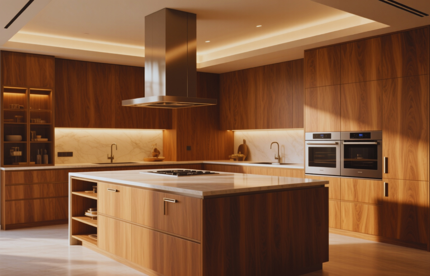
Wood cabinetry brings warmth and natural texture, but countertop color determines whether the space feels cohesive or disconnected.
Warm whites and light neutrals highlight wood grain instead of competing with it.
Ideal for:
Avoid icy whites that can make wood look dull or gray.
Greige surfaces bridge warm and cool elements beautifully.
Benefits include:
Wood cabinets pair beautifully with quartzite-style veining.
Best applications:
Let the stone shine and keep other surfaces quieter.
Dark cabinets create drama, but countertop color determines whether the kitchen feels elevated or heavy.
White countertops against dark cabinets are a classic choice for a reason.
Best for:
Choose a slightly warm white if your lighting is warm.
Creamy countertops soften dark cabinetry without sacrificing contrast.
Popular pairings:
Light to medium neutrals create depth without harsh contrast.
Why it works:
Dark countertops with dark cabinets can be stunning when executed carefully.
Success requires:
This approach delivers high-end impact when planned intentionally.
Use this quick checklist before committing:
Design Surfaces helps homeowners test slabs under realistic conditions to avoid these issues.
Color, veining, and undertone are impossible to judge online. Design Surfaces is a premium destination for countertops, tile, and stone, serving homeowners, designers, and contractors across Cleveland who want clarity and confidence. Our Westlake showroom allows you to compare full slabs, coordinate finishes, and build a kitchen palette that feels intentional from every angle.
Choosing countertop colors for white, wood, and dark cabinets comes down to undertone, lighting, and contrast. White kitchens benefit from depth and warmth, wood kitchens shine with balanced neutrals and natural movement, and dark kitchens succeed with thoughtful contrast or layered monochrome looks. For Cleveland homeowners, viewing materials in person is the smartest way to ensure lasting results.
Ready to choose a countertop color that elevates your kitchen? Visit the Design Surfaces showroom, explore premium slabs in person, or contact our team to build a kitchen design that feels refined, balanced, and timeless.
Call: 440.753.6952 • Contact: Submit a Request • Email: info@designsurfaces.com


