Contact info +
.png)
.png)
.png)
Showroom Hours:
Mon-Fri - 9AM-5PM | Sat - 10AM-2PM | Sun - Closed
Mon-Fri - 9AM-5PM | Sat - 10AM-2PM | Sun - Closed


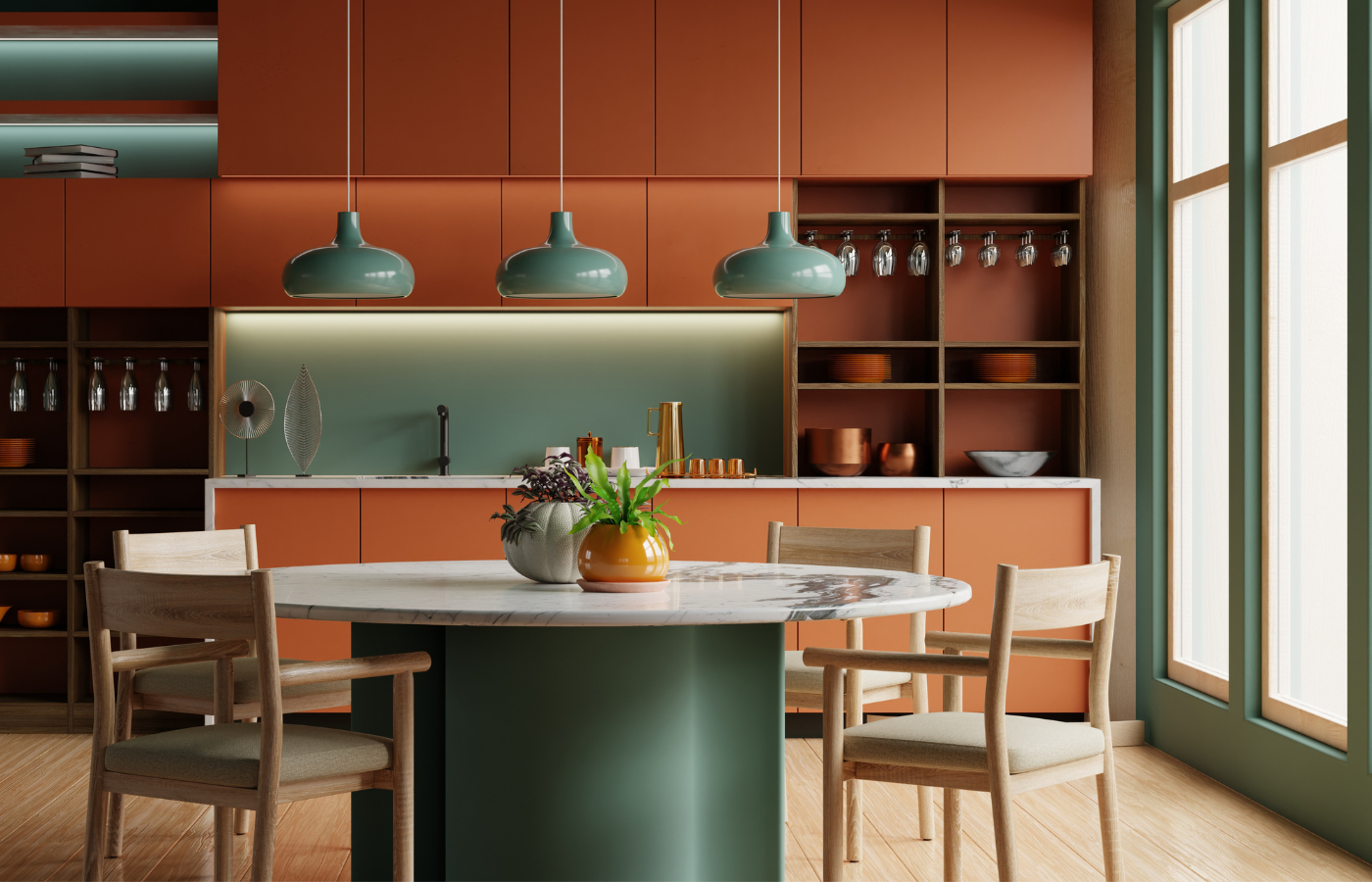
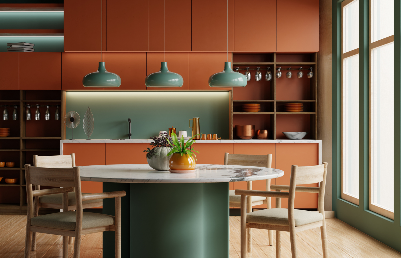
A kitchen can have beautiful cabinetry, high-quality finishes, and thoughtful layout, yet still feel slightly off. Often, the issue is not the cabinets themselves. It is the countertop color that does not quite align. At Design Surfaces, we guide Cleveland homeowners through one of the most important design decisions in the space: how to choose countertop color for kitchen cabinets in a way that feels intentional, balanced, and refined. When done correctly, the relationship between these elements defines the entire kitchen.
Countertops occupy a large visual plane. They sit directly against cabinetry and influence how every other material is perceived.
The right color can:
The wrong choice can make even high-end materials feel disconnected. Understanding how to choose countertop color for kitchen cabinets ensures the space feels complete rather than assembled.
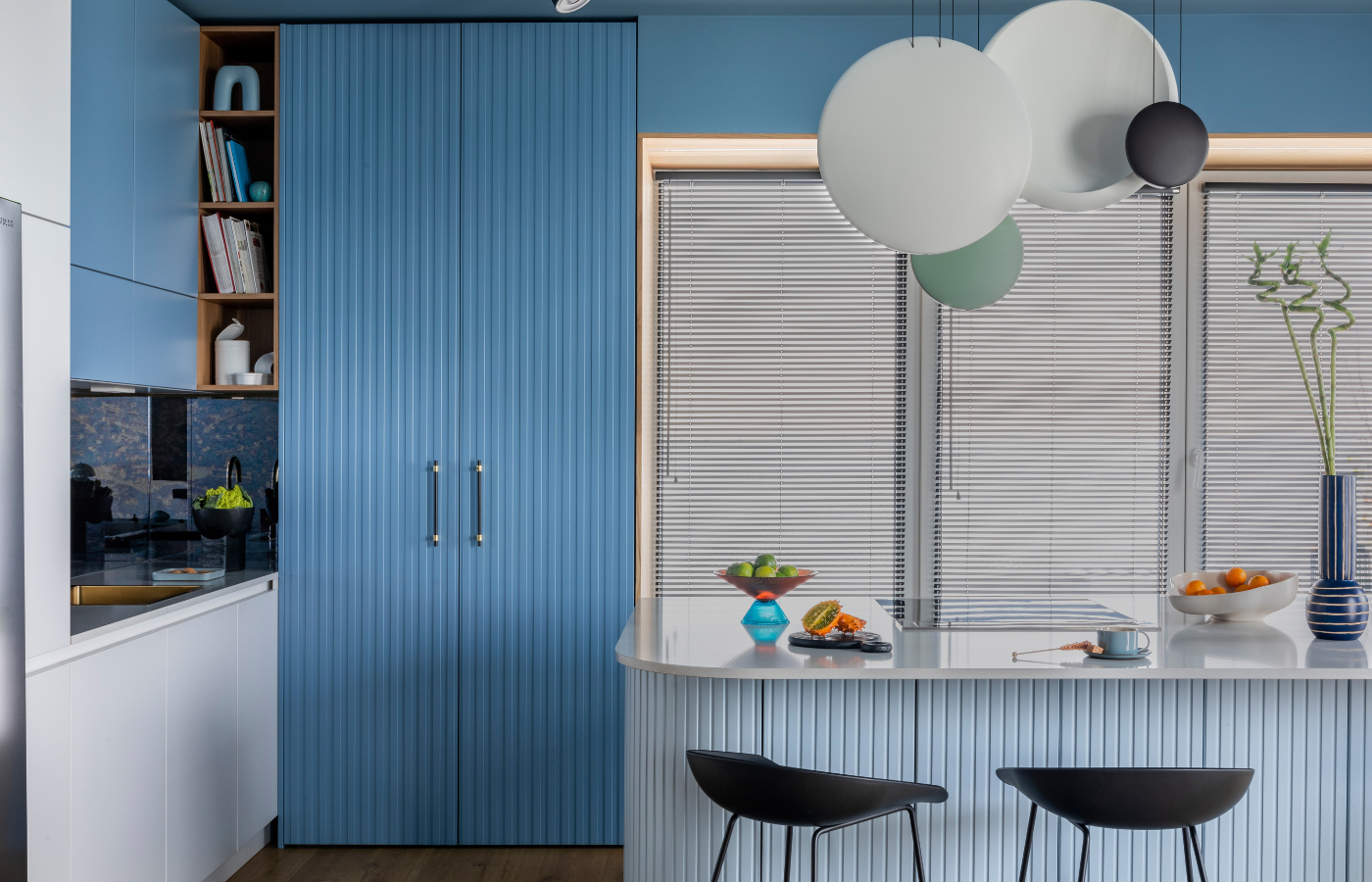
Cabinet color is often described in simple terms such as white, gray, or wood. What matters more is the undertone.
White cabinets, for example, can lean:
Wood cabinetry may carry:
Countertop selection should align with these undertones rather than contrast them unintentionally. This is where many kitchens lose cohesion.
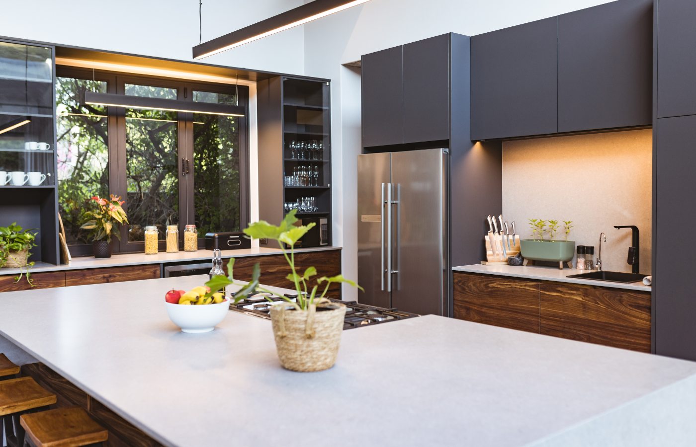
One of the first decisions to make is whether the kitchen should feel bold and defined or soft and layered.
A darker countertop against lighter cabinetry creates visual structure. This approach works well in:
Contrast adds clarity and makes individual elements stand out.
A countertop that stays within the same tonal family as the cabinets creates a more subtle effect.
This approach allows the space to feel open and cohesive.
Rather than choosing a color in isolation, consider the full slab. Movement, veining, and variation play a significant role in how the countertop interacts with cabinetry.
A slab with bold veining can:
Subtle, consistent slabs create a quieter backdrop, allowing cabinetry or fixtures to take the lead.
At Design Surfaces, we encourage homeowners to view full slabs whenever possible, as this reveals how the material will truly perform in the space.
Natural light varies significantly depending on the home and layout. In many Cleveland homes, seasonal light changes can influence how colors are perceived.
A countertop that looks balanced in bright daylight may feel heavier in lower light conditions. Similarly, darker cabinets paired with darker surfaces can make a space feel smaller if not balanced correctly.
When evaluating how to choose countertop color for kitchen cabinets, it is important to view samples in the actual environment where they will be installed.
Countertops do not exist in isolation. They interact with flooring, backsplash, and hardware.
To maintain cohesion:
A well-chosen countertop often acts as the bridge between these elements, tying the entire design together.
While design is central, performance should not be overlooked.
Lighter countertops can show less dust and smudging, while darker surfaces may highlight fingerprints or residue.
Quartz offers consistency and ease of care. Natural stone provides depth but may require more maintenance.
High-use kitchens benefit from materials and colors that conceal everyday wear without compromising design.
Understanding these factors ensures that the chosen countertop supports both aesthetic goals and daily use.
While every kitchen is unique, certain combinations continue to perform well in both design and functionality.
These pairings succeed because they respect undertones and create balance rather than conflict.
In some kitchens, the countertop becomes the defining feature.
This is often achieved by:
This approach works particularly well in open-concept homes where the kitchen is a central visual element.
Neutral, well-balanced combinations tend to appeal to a wider range of buyers. While bold choices can be impactful, they should be considered carefully in the context of long-term value.
A countertop that complements cabinetry without overwhelming it is more likely to maintain appeal over time.
For homeowners thinking ahead, understanding how to choose countertop color for kitchen cabinets becomes a decision that supports both current enjoyment and future resale.
Small samples can be misleading. The interaction between countertop and cabinetry becomes clear only when materials are viewed together at scale.
This is why visiting a showroom and placing samples side by side is so valuable. It allows you to:
At Design Surfaces, we guide this process with a focus on clarity and design alignment, serving homeowners, designers, and contractors across Cleveland.
The most successful kitchens are not defined by individual elements. They are defined by how those elements work together.
Choosing the right countertop color ensures that cabinetry, flooring, and finishes feel connected rather than competing. It is a decision that shapes both the visual and functional experience of the space.
Understanding how to choose countertop color for kitchen cabinets allows homeowners to move beyond guesswork and toward intentional design. The goal is not simply to match colors, but to create a balanced composition that feels refined and complete.
At Design Surfaces, we help homeowners navigate these decisions with a focus on both aesthetics and performance. The result is a kitchen that reflects thoughtful planning and lasting quality.
A countertop is more than a surface. It is a defining element that influences how the entire kitchen is experienced.
By selecting a color that aligns with cabinetry, lighting, and lifestyle, homeowners can create a space that feels cohesive and elevated. With the right guidance, the process becomes clear, and the result feels effortless.
Design Surfaces offers the materials and expertise to help bring that vision into focus, allowing you to make decisions with confidence and create a kitchen that feels truly complete.
Call: 440.899.9900 • Contact: Submit a Request • Email: info@designsurfaces.com


